
Hello world! I did a thing. I bought an iPad. I installed Procreate. I learned to make stickers.
I’ve been wanting to do this WEIRD thing for ages. Maybe as far back as 2014, when I purchased a Wacom tablet and learned to use Adobe Illustrator. Of course, work and life got in the way and so I sidelined dabbling in digital illustration until the Wacom tablet was out of date and I’d lost my access to Illustrator. Yep, great job Candy.
Then, this miraculous thing called Procreate was invented and slowly I began to see art—as good as that made on Illustrator—get created on a tool that was only 100x more simple to use.
(And yes, on another sidenote, I used em dashes and guess what, this writer knew how to use them before ChatGPT began giving everyone the gift of supposedly knowing how to use them. I’ll save that rant for another time.)
Related Reading: Why I’m Choosing to Write Without AI (Even If It Slows Me Down)
In 2023 I purchased an iPad and returned to my OG goal: digital illustration and sticker design. I watched YouTube tutorials. I watched Procreate’s own tutorials. I purchased a subscription to Skillshare and I watched my first ever sticker tutorial. I was, admittedly, a little put off by the skillshare tutorials as they focused so much on kawaii character design which wasn’t my favorite.
In case you’re not familiar with the term, kawaii is a Japanese word meaning “cute.” It’s also a cultural phenomenon in Japan that began in the 70s. Hello Kitty is part of the kawaii aesthetic, for example. You can tell something is probably kawaii when it makes use of soft pastel colors, rounded shapes and features that evoke emotion and a sense of vulnerability. Think wide eyes, tiny mouths, and lots of eye shine for an almost teary, heart-wrenching feel.
But, let’s go back to what I said: I did not love this aesthetic when it started. In fact, growing up, I avoided anything Hello Kitty. It was too cutesy and silly for me, more appropriate to younger children I think. If you’d given me a cat that didn’t dress in clothes and wasn’t attempting to mimic a human, I’d have found that far more appealing. Incidentally, this is what’s happened over time. The aesthetic has adapted and there are far more design options that supposedly still fall within it. Today, kawaii is more up my alley, though still, perhaps, not my favorite. Truth be told, I don’t yet have my own illustration style as I’m still learning. I try everything. Experimenting like this teaches me a lot. Maybe one day I’ll have my own style.
Related Reading: Canva Painting 101, or How to Create Unique Blog Images Using Canva
I think the primary reason most illustrators teach drawing kawaii or chibi graphics (another graphic style that falls within the kawaii aesthetic) is that they’re relatively easy to learn. Shapes are rounded and simple and as long as you get those eyes right, well you can turn anything into a character, from a potato spud to a tube of hand lotion.
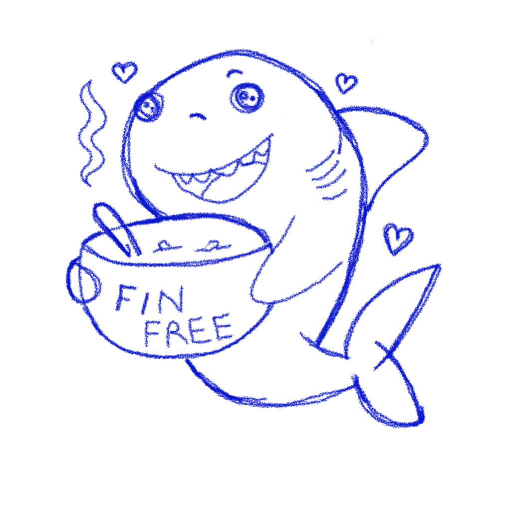
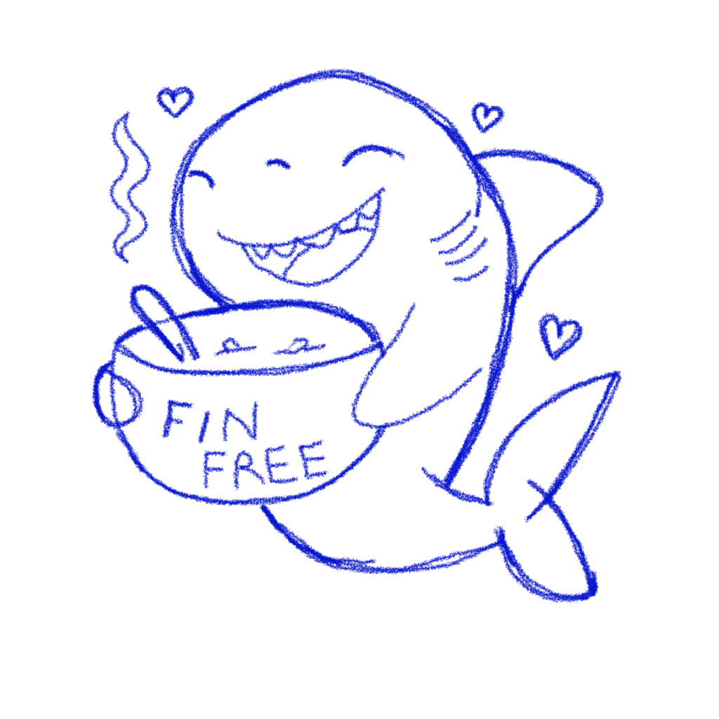
In spite of wanting to make more realistic stickers, I began with kawaii. I wanted to deal with an emotional topic that I felt strongly about first because I knew then I’d invest time in it. I came up with the idea to create a shark holding a little bowl of soup that read “fin free” on it. This was particularly pertinent to me at the time as I’d been reading a lot about the shark fin trade and about the thousands of sharks killed each year for their fins alone. I wanted a sticker that said something about what I believed in, as well as that looked cute. I couldn’t find one for sale online so I gave myself the task. Given my skillset now seemed to lie firmly with the kawaii range (er, thanks Skillshare…), I began there.
My initial illustration was ugly! But, I’d learned that the first thing to get right was shapes.

Prior to this (not shown here), I’d done a study on sharks. I’d collected a number of pictures of them seen from different angles and I’d traced over them in nothing but shapes. This taught me a lot about the shapes a shark is comprised of, which means that when it came time to be creative, I understood them better. Though I don’t have that initial scratch pad of shark shapes, here’s one I do have for a cuttlefish. I actually picked up this skill on Skillshare where you can find a cute tutorial on illustrating fish.

You can see from these images that I’m getting a feel for the shapes that comprise these creatures. It’s a really low barrier to entry to explore this way and I highly recommend it. It has the added benefit of making you more observant in real life. I was taught to do this as a kid when learning to draw but I don’t think the teachers emphasized the added benefit of it teaching you to understand. Today, ask me to draw a horse, and Ill have a perfect drawing in no time. Can you tell I was a horse girl?
From this point on, the next step is to come up with a sketch (on another layer) that you’re happy with. This includes the “cute-ing” process as I like to think of it. Round out features, soften, give an adorable expression. Make some adjustments.
You can see in my case, we’re a lot closer to the original design now. Though there are some differences. As I traced in outlines, I realized for example that the spoon was too cluttered facing the same direction as the shark and I didn’t like the open eyes as they made the shark look like a character out of Coraline. I tried smaller eyes too and those didn’t have the emotional impact I was going for either. And so, I simplified!
The next step was to perfect the outline. In this “perfected outline,” I used Procreate’s studio pen to create playful lines. I added my Instagram handle in a technical pen script as I could make it really tiny and I decided not to pen in the steam and hearts. I wanted those to appear softer too (no outlines!). I also added missing fins and edges.

The next step was truly where the fun began. Who doesn’t enjoy coloring in?! I turned my final outline layer into a reference layer (this makes it easy to color drop and do a number of other things), and I began experimenting with colors, textures, and brushes. At this time I didn’t really know how to use alpha and clipping masks (filters you apply to your layers) so a lot of what I did turned out okay in spite of itself. You can see here when I only turn on a coupe of layers how very hand drawn it looks.

It gets a lot better when I start adding shadows and little shiny-like lines. Well, at least I think so. Now my rough and ready look is part of the character.
And a note on his soup! Yes, it has a fishy in it but that’s what sharks eat. It’s got no shark fins in it however!

Once I was “done” with the image, I put it on a wildly different-colored background so I could check to see if I’d forgotten to fill any parts. This is super easy to do when you’re illustrating on a white background. You’d be surprised. You can see I need to fill the shark’s mouth so this isn’t an issue when it comes time to print. You can also see from this image that there are some tiny parts where I didn’t color in well enough (I’ve since learned to use color drop and alpha masks to make up for this).

The final part was to draw the white outline (you place the layer under the shark and then draw around. It’s kind of fun as it makes your sticker really feel like a sticker. Unfortunately, I got distracted and forgot to fill the mouth/tongue area. I don’t think it detracts too much from the original but it is a rookie mistake! Were I to send it to the printers again today, it would be a little more cleaned up.
A note on outlining: some sticker services add to your outline, or allow you to add one if you don’t have one. Mine does both.

To be clear, many of my early stickers were really bad. If you want an example to make you feel better (at least if you’re learning yourself), here’s one of the first ever drawings I made in Procreate when I had no idea how to use anything and no notion of how stickers worked. Clearly I thought one went about the process in a very different manner!

Anyway, I’m not sure what the point of this whole post is but to share the fact that I’m now attempting to add yet another hobby to the mix. If you’d like to purchase stickers, you can check out my stickers here or head on over to my Etsy shop and buy them (don’t forget, you’ll be supporting a starving artist AND getting a tattoo you don’t have to tie yourself to for life—okay, so that’s how I think about stickers). I’m also able to fulfill larger custom orders, or create custom stickers depending on your request. In that case, shoot me a message on Etsy and I’ll set up a custom product.

